Designing a website today is about more than just visuals, it’s about creating a layout that looks and works perfectly across all devices. Choosing the right size to design a website is essential for delivering a great user experience, whether someone is visiting from a desktop, tablet, or mobile phone.
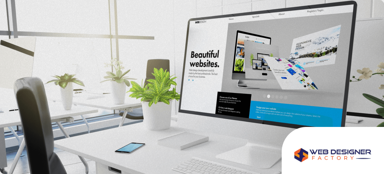
At Web Designer Factory, a leading website designer service based in Plano, TX, we understand that screen size directly impacts how users interact with your site. In this guide, we’ll explain what size to design a website and how to ensure your layout stays responsive and effective across all platforms.
Why Website Size Matters
When users land on your site, you have only a few seconds to make a positive impression. If your layout looks broken, doesn’t load correctly, or forces them to scroll awkwardly, you risk losing them.
Designing for the right website size improves:
- Readability and usability
- Page load speed and structure
- Conversion rates and engagement
- SEO performance and mobile rankings
The goal is to create a website that works seamlessly on every screen, not just one device or resolution.
The Standard Website Design Width
For desktop screens, the ideal website width typically falls between 1280px and 1440px. This range ensures your content fits well on modern monitors while still offering enough space for clear navigation, text blocks, and imagery.
A common design standard is a container width of 1140px, centered within the browser window. This layout size is used by many responsive frameworks, including Bootstrap, and ensures content doesn’t stretch too wide on larger monitors.
At Web Designer Factory, we often use a 12-column grid system within this width to maintain consistent spacing, alignment, and flexibility.
Full-Width vs. Fixed-Width Layouts
Understanding layout structure is just as important as setting pixel dimensions.
Full-Width Layouts
A full-width design spans the entire screen. These are useful for modern landing pages, hero banners, and immersive imagery. However, they require careful handling of content width so text doesn’t stretch too far, which can hinder readability.
Fixed-Width Layouts
Fixed-width websites maintain a consistent content area, regardless of screen size. This makes them predictable and easy to control. For most business websites, we recommend a content width between 1024px and 1140px, surrounded by margins or padding.
Both layouts can be responsive, as long as breakpoints are used to adjust the design for smaller screens.
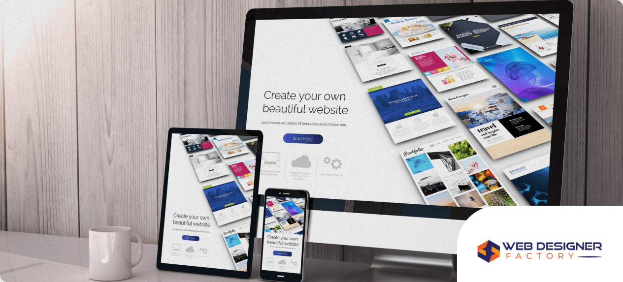
Mobile Screen Sizes and Breakpoints
With over half of all web traffic now coming from mobile devices, designing for mobile isn’t optional. It’s critical to define responsive breakpoints to adjust your design for different devices.
Here are the most common breakpoints used in responsive design:
- Mobile (up to 767px): Design for 375px width (iPhone 12/13 standard)
- Tablet (768px – 1024px): iPad and similar-sized screens
- Small desktop/laptop (1025px – 1366px): Most laptops and small monitors
- Large desktop (1367px and up): Widescreen and ultrawide monitors
These breakpoints allow you to modify layout elements such as font size, image scaling, and column stacking to fit the screen. At Web Designer Factory, we design using a mobile-first approach, ensuring performance and appearance are optimized starting from the smallest screen.
Recommended Design Sizes for Key Devices
While modern web design relies on flexible, percentage-based layouts, it’s helpful to know the most common device screen widths:
- Mobile (phones): 360px to 414px
- Tablets: 768px to 834px
- Laptops and desktops: 1280px to 1920px
- High-resolution screens (4K+): 2560px and above
Designing for a fluid experience means preparing your website to adapt and realign content elements at each of these levels.
Height Considerations and Scroll Length
While width gets most of the attention, height also plays an important role. The average screen height is around 768px to 1080px, but websites can be much longer due to vertical scrolling.
Design your content in screen-height sections that guide the user naturally down the page. Visual breaks, such as color blocks or full-width images, help define sections and improve engagement. Avoid stuffing too much information above the fold. Instead, focus on clear hierarchy, strategic CTA placement, and smooth transitions as users scroll.
Tools to Use When Designing for Size
To design accurately across screen sizes, professional tools like Figma, Adobe XD, and Sketch allow you to set up responsive frames and grids.
Use built-in presets or create custom artboards for:
- 375px wide for mobile
- 768px wide for tablets
- 1440px wide for desktop
- 1920px for widescreen testing
These tools help simulate how your website will appear on real devices and allow for interactive prototyping. Web Designer Factory uses these tools to deliver pixel-perfect designs and responsive layouts tailored to your audience.
Testing Across Devices
Once your site is designed and developed, test it thoroughly on real devices and emulators. Tools like Chrome DevTools, BrowserStack, and LambdaTest let you preview your site on hundreds of device types and screen resolutions.
Things to look for during testing:
- Does the layout adapt without horizontal scrolling?
- Are buttons and navigation links easy to tap on mobile?
- Does the font remain legible across screen sizes?
- Are images scaling correctly without distortion?
Responsive testing ensures a professional experience for every visitor, no matter what device they use.
Final Thoughts
Designing a website with the right size in mind is essential for providing a seamless user experience and maximizing conversions. From setting the correct content width to defining mobile breakpoints, every element of your layout should be planned with device flexibility and usability in mind.
At Web Designer Factory, we help businesses in Plano, TX and beyond design websites that look and perform perfectly on all screen sizes. Whether you’re launching a new brand or refreshing your current site, our team ensures your layout is responsive, modern, and aligned with today’s standards.
Ready to design a website that fits all screens?
Contact Web Designer Factory today for expert website design services built for today’s multi-device world.