Digital Services for Texas Businesses Ready to Grow
Web Designer Factory builds websites and runs SEO for small businesses in Dallas, Houston, Austin, San Antonio, and across Texas. Since 2017, we have completed 1,500+ projects for contractors, law firms, medical practices, and local retailers who need a website that ranks on Google and turns visitors into calls. Web design and SEO from one team, no long-term contracts.
Across multiple industries, our clients trust us to create high-performing websites using website builder platforms, custom code, and advanced development techniques. From marketing campaigns to Google Analytics tracking, we ensure every site is ready to perform in search engines and deliver measurable results.
Custom plumber website designs optimized for local search and instant calls. Built to help plumbing businesses get found, earn trust, and win more service requests.
High-performing law firm websites optimized for visibility and lead generation. Designed to attract clients, highlight practice areas, and drive consultations.
High-converting websites designed for electricians and electrical contractors. Built to generate service calls, highlight expertise, and grow local visibility.
Custom roofer websites optimized for local searches and quote requests. Built to help roofing companies get discovered and convert visitors into customers.
We have built websites for 1,000+ small businesses across Dallas, Plano, Frisco, Fort Worth, Richardson, Allen, Carrollton, and all of DFW since 2017. Every project is custom-built, priced upfront with no surprises, and optimized for local search from day one.
Transform your online presence with custom website designs that capture your brand and convert visitors into customers. Our designs are mobile-responsive, fast-loading, and optimized for both Google and AI search platforms.
Build powerful, scalable websites with clean code and modern frameworks. We develop custom solutions tailored to your business needs, ensuring your site performs flawlessly across all devices.
Improve your visibility in search results with technical SEO, on-page optimization, content strategy and local SEO support designed to attract qualified visitors.
Reach potential customers through SEO, local marketing, paid campaign support and conversion-focused strategies built around measurable business goals.
Create a reliable lead pipeline with landing pages, lead capture systems, cold email outreach, LinkedIn outreach and CRM workflows that support faster follow-up.
From website templates and drag-and-drop editors to fully custom CSS, we work with professional website builder tools like WordPress, Shopify, and WooCommerce. Each site is optimized for mobile and desktop performance, security, and ease of management.
Case Studies
Our clients count on us for websites that deliver results.
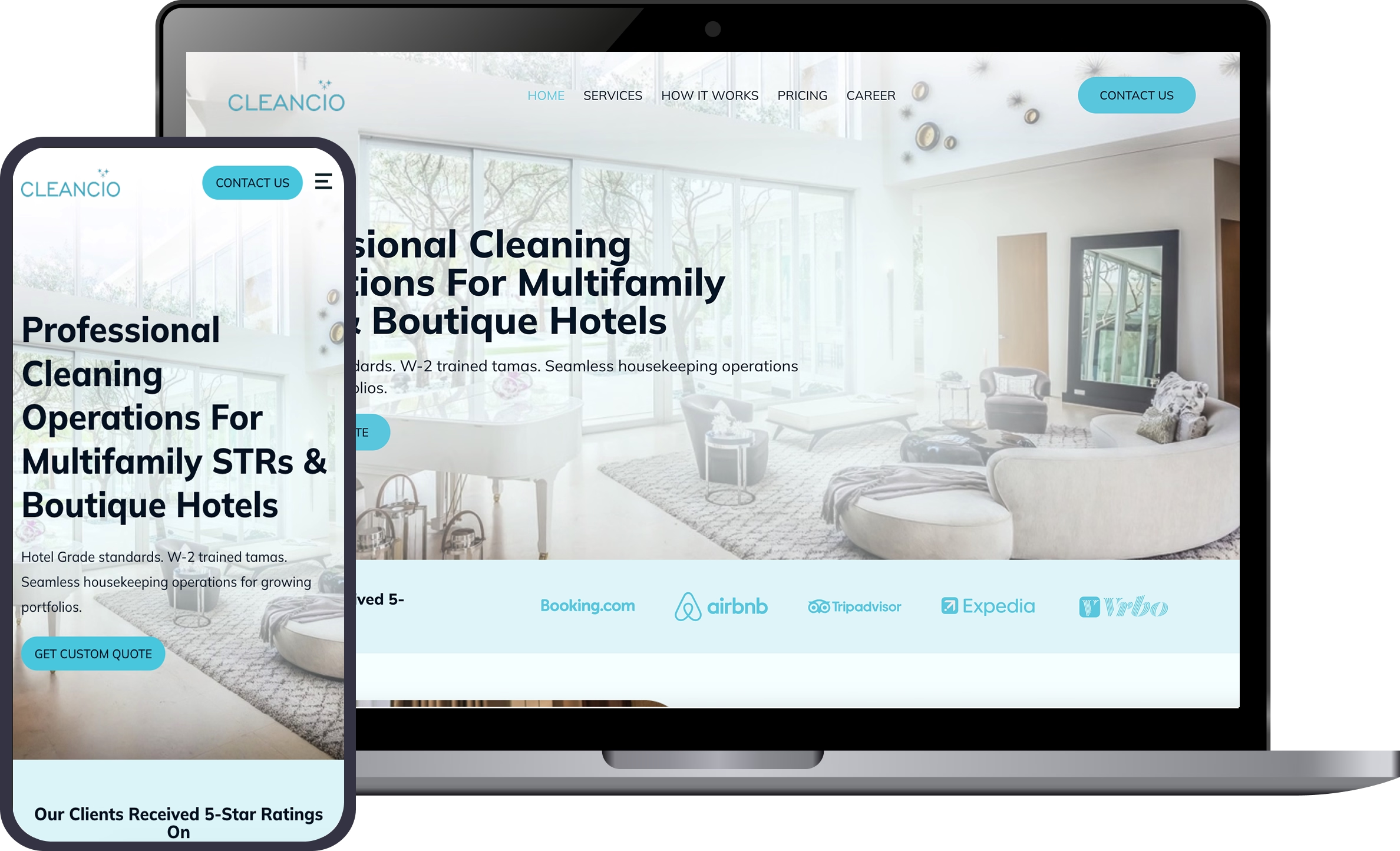
Cleancio is a professional cleaning services platform serving short-term rentals, boutique hotels, and vacation rental operators. We built a conversion-focused website that clearly communicates scalable operations, hotel-grade cleaning standards, and dependable service delivery for multi-unit properties across Chicago and Dallas.
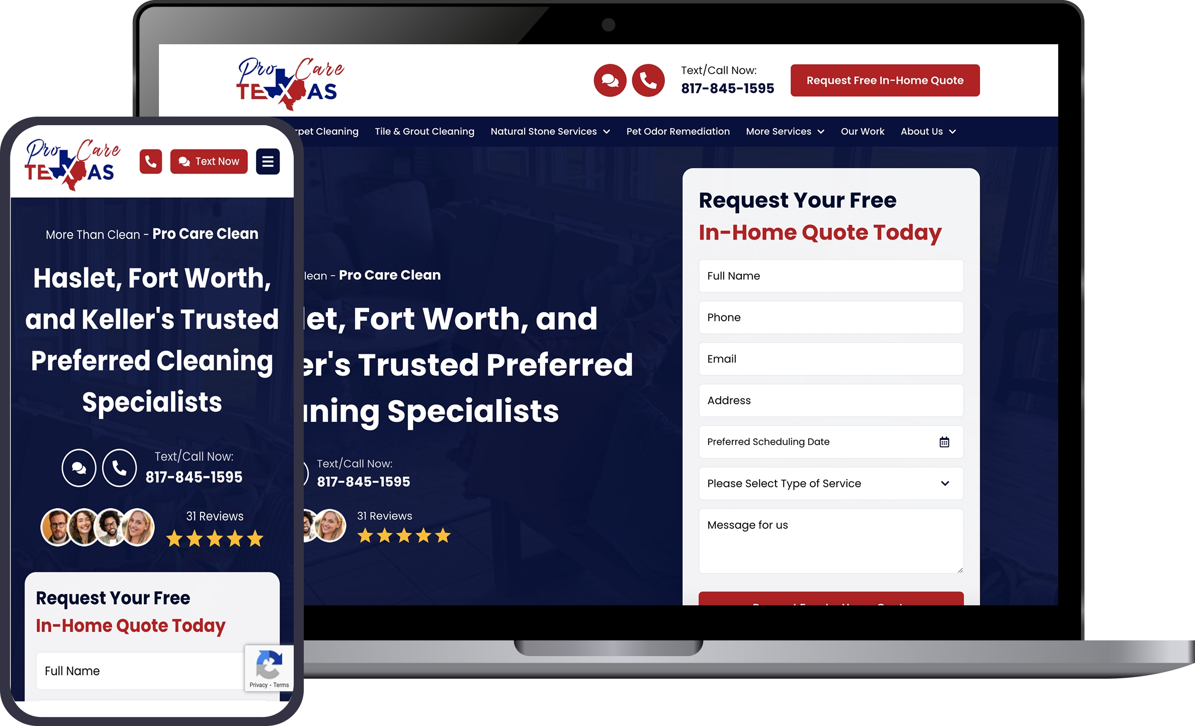
ProCare Texas is a US based professional cleaning services company serving residential and commercial clients for over 20 years. We built a high performance frontend using Next.js with WordPress as a headless CMS, managing all service content, images, and videos through GraphQL and advanced custom fields.
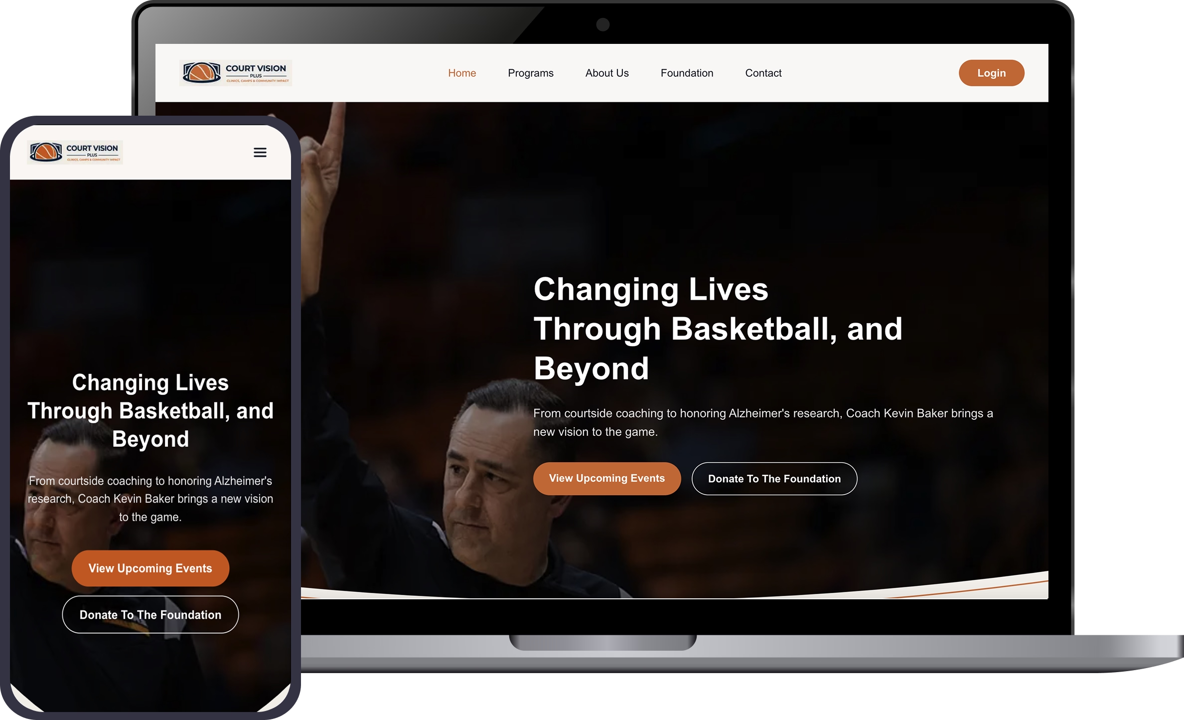
Court Vision Plus is a professional coaching platform for Coach Kevin Baker, offering basketball training programs backed by 30 plus years of experience. The website also supports a foundation initiative for Alzheimer’s awareness, with a booking driven system that allows students and parents to manage clinics, lessons, and events through a secure dashboard.
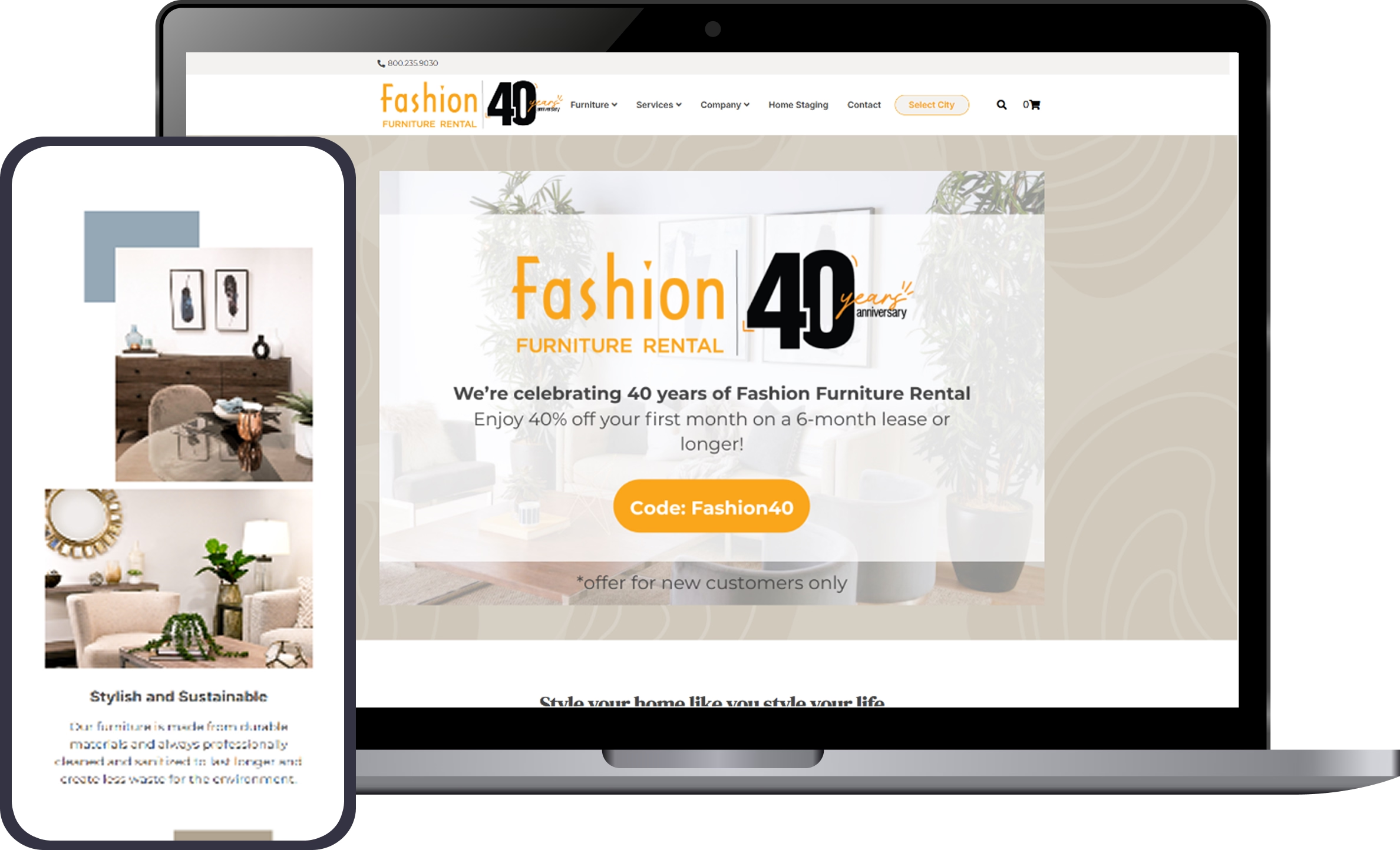
A sleek, responsive design showcasing premium furniture collections. Features optimized product pages, intuitive navigation, and fast load times to keep customers engaged and improve conversion rates. Built to reflect the brand’s style while enhancing online sales.
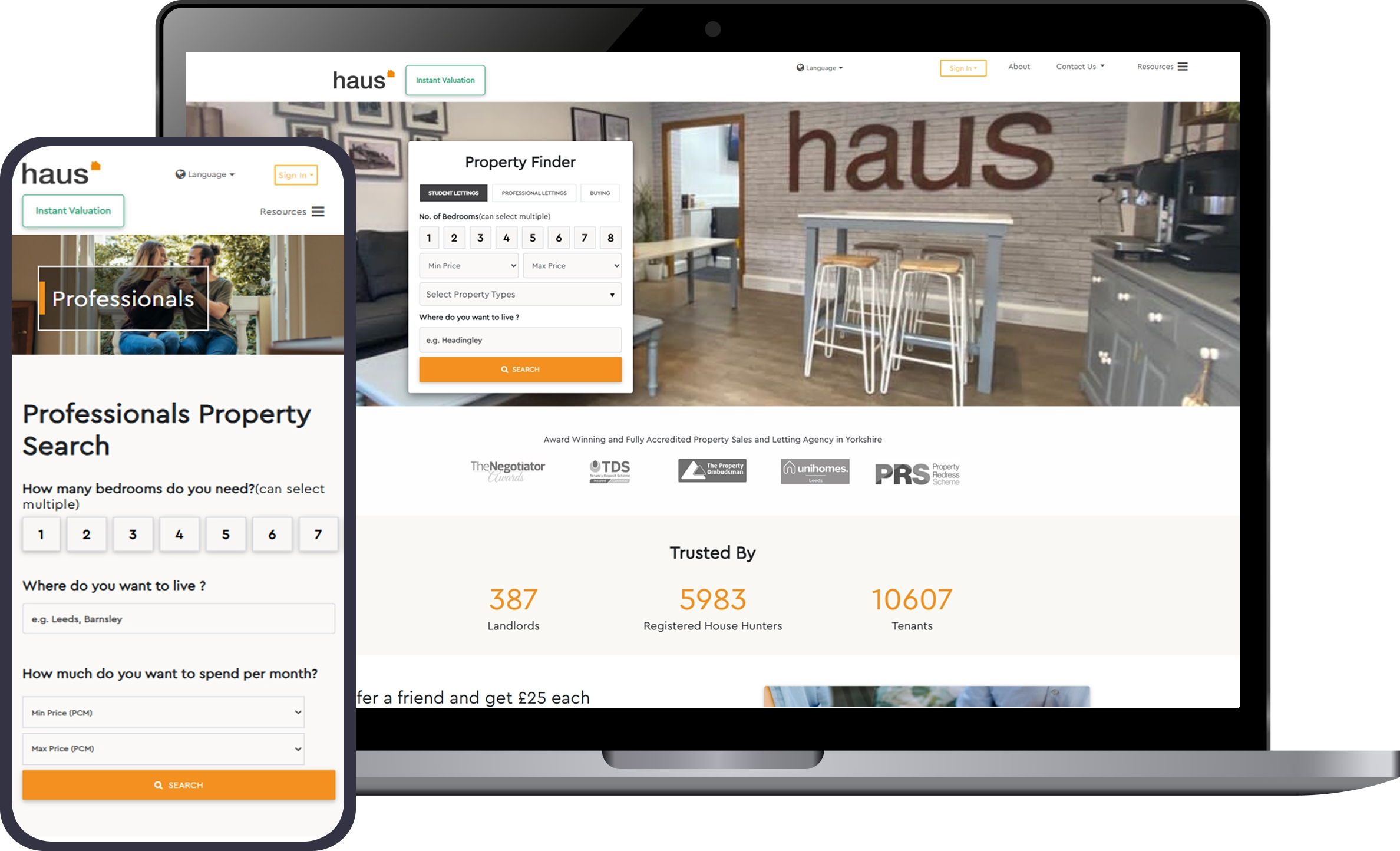
A modern website design for a real estate firm, blending stunning visuals with clear property search tools. Optimized for SEO and mobile, it delivers an engaging customer journey and strong lead generation for the business.
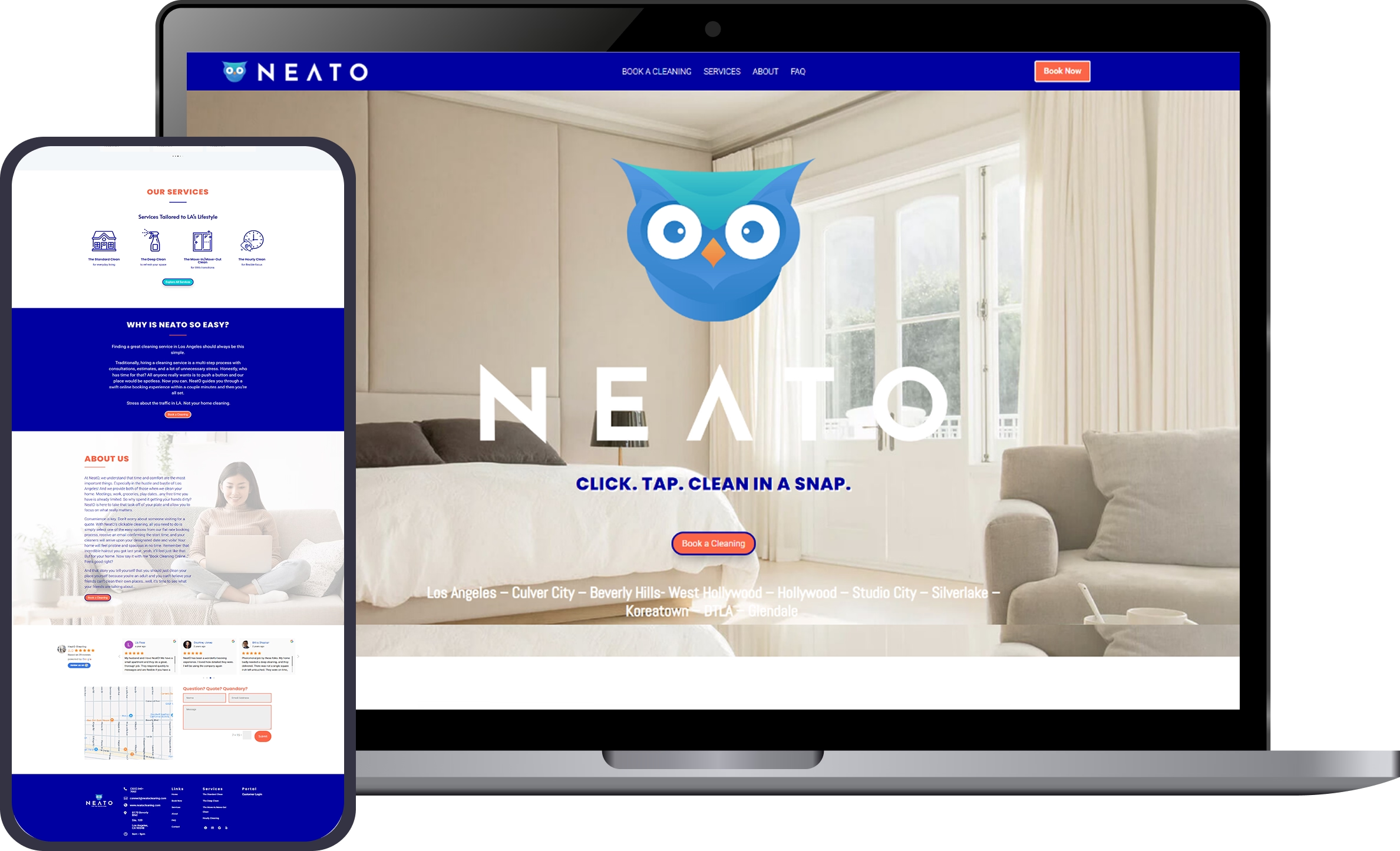
A stylish website for a design-forward brand, combining minimalist layouts with interactive elements. Features scalable architecture, optimized loading speed, and branding that captures the company’s vision. Designed to engage the target audience and drive customer loyalty.
When you work with us, you are not just getting a website, you are gaining a partner dedicated to your success. We handle the details, keep the process transparent, and provide ongoing support so you can move forward with confidence.
I am pleased to recommend Web Designer Factory following the successful completion of my website. The team delivered the project exactly on schedule, demonstrating an efficient and reliable turnaround. Communication throughout was clear, professional, and responsive, ensuring that every instruction I provided was followed precisely and implemented effectively. The final website is modern, polished, and fully aligned with my requirements. I appreciate their attention to detail and commitment to client satisfaction. Should you require a dependable partner for web design, Web Designer Factory comes highly recommended. Thank you for the outstanding work.
Abbas, Amit and crew nailed it! They created a custom coded website from scratch for our cleaning company, Pro Care Texas. The design is very professional, the quality superb, and the communication is on point! I am very thankful to have chosen Web Designer Factory for the design of our website. I think it is one of the fastest loading sites we’ve ever had! Thank you
I wanted to express my gratitude for the incredible logo design by Abbas. His creativity and attention to detail have exceeded my expectations. The logo perfectly captures my brand’s essence, and I’m thrilled with the outcome.
I would recommend Ghulam to anyone struggling with updating their website, whether that’s coding, SEO work or doing updates. As a small business owner, I’m familiar with how to do simple things on my WordPress website but when I came to Ghulam with a challenging project (for me anyway) it was completed quickly and professionally. He made sure I was satisfied with the work he did and helped show me how to access certain features I wasn’t familiar with. Fast forward to months later and I messaged him in a panic after I crashed my website. He had my website back up and running in hours without any question or delay. I will definitely be hiring him again to continue to update my website and keep it running smoothly.
Frequently asked questions
What types of websites do you design and develop?
We create websites for every industry, from e-commerce stores to portfolio sites. Whether starting from a template or building from scratch, we tailor each page and feature to match your brand and market needs.
What is your web design process like?
Our team follows a clear development process: discovery, design, build, test, and launch. We focus on collaboration, keep you updated, and ensure each site is optimized for search and marketing.
Will my new website be mobile-friendly and responsive?
Yes. Every site is tested on desktop, mobile, and tablet. Responsive design improves user experience and search rankings while meeting security and performance standards.
How can a new website help my business grow?
An effective website builds trust, drives organic traffic, and supports marketing campaigns that bring in new customers. With Google tracking, you can measure results and refine strategies.
What do you need from me to get started?
We’ll connect for a quick call to discuss your business, budget, and ideas. Share any existing assets like logos or templates, and we’ll guide you from there.
Do you offer Search Engine Optimization (SEO) services?
Yes. Our SEO services include research, on-page optimization, Google Analytics setup, and marketing tips.
What other services do you offer besides web design?
In addition to web design, we offer branding, blog content, secure hosting, and marketing strategy to help you manage your online growth.
How much does a new website cost?
Most websites and online stores range between $2,500 – $7,500, depending on scope, features, and platform. Advanced custom solutions and SEO campaigns are quoted separately to fit your goals. We’ll provide a clear, tailored estimate that matches your budget.
How long will it take to design and build my website?
Timelines vary. Simple pages may take weeks; larger platforms with more features take longer. Our team works to maintain speed without sacrificing quality.
Why choose Web Designer Factory?
We’re a leading website builder and developer team that blends marketing, design, and security. Our goal is to showcase your brand and help you succeed in today’s online market.